
How to have coherent and homogeneous painting colors for a room? It is a more difficult project than it seems, which is why we have provided you some of our best advice.
1. Create a color diagram with your room furniture
Always remember that, although there are thousands of shades of painting at the store, there are only seven colors in the spectrum of painting: via red, orange, yellow, Green, blue, indigo and purple … Remember to eliminate some before going to a Brico/Deco store.
Here is our infallible method in 4 steps to create a color scheme:
Start by selecting three colors from an existing object in your home. Take a cushion from the family room, your favorite tie or scarf, or a table – anything that brings you comfort or has an emotional link for you – and take this object to the painting store. Find three strips of samples with these colors, and you instantly have 15 to 18 colors that you can use, since each bunch of samples generally contains six colors of paint.
The next step is to choose one of the three paint colors as a wall color and keep the other two to use them around the room in the fabrics or furniture.
To choose the colors of the adjacent pieces, take the same samples of three original colors and select another color.
Finally, choose a fourth color which can be used as an accent: splash a little of this color in each room of the house, through a cushion, a plate or a work of art. This creates a link between spaces
2. Decide the finish to create an attractive visual effect
Once you have your colors in hand, think about the finish you are going to use. Although today’s matt paintings are more resistant to spots, conventional wisdom has long wanted a satin finish (also called eggshell) is the best for walls because it can be rubbed and attracts Not attention to imperfections. The semi-brilliant and brilliant finishes, it was thought, had to be reserved for the garnishes, where they could accentuate the curves of a molding or the panels of a door.
Today, however, finishes are also used to create visual effects on the entire wall. Paint a wall with a mat finish and the wall adjacent with a satin finish, both of the same color, and when the light strikes the walls, it creates a velvet effect. «Likewise, you can paint the walls in mat and The satin ceiling to obtain a contrast between the mat and the brilliant. (the ceiling will seem above as it will reflect the light). The more important the chandelier, the more attention to the surface.
3. Adapt the color to the printing you want to give to the room
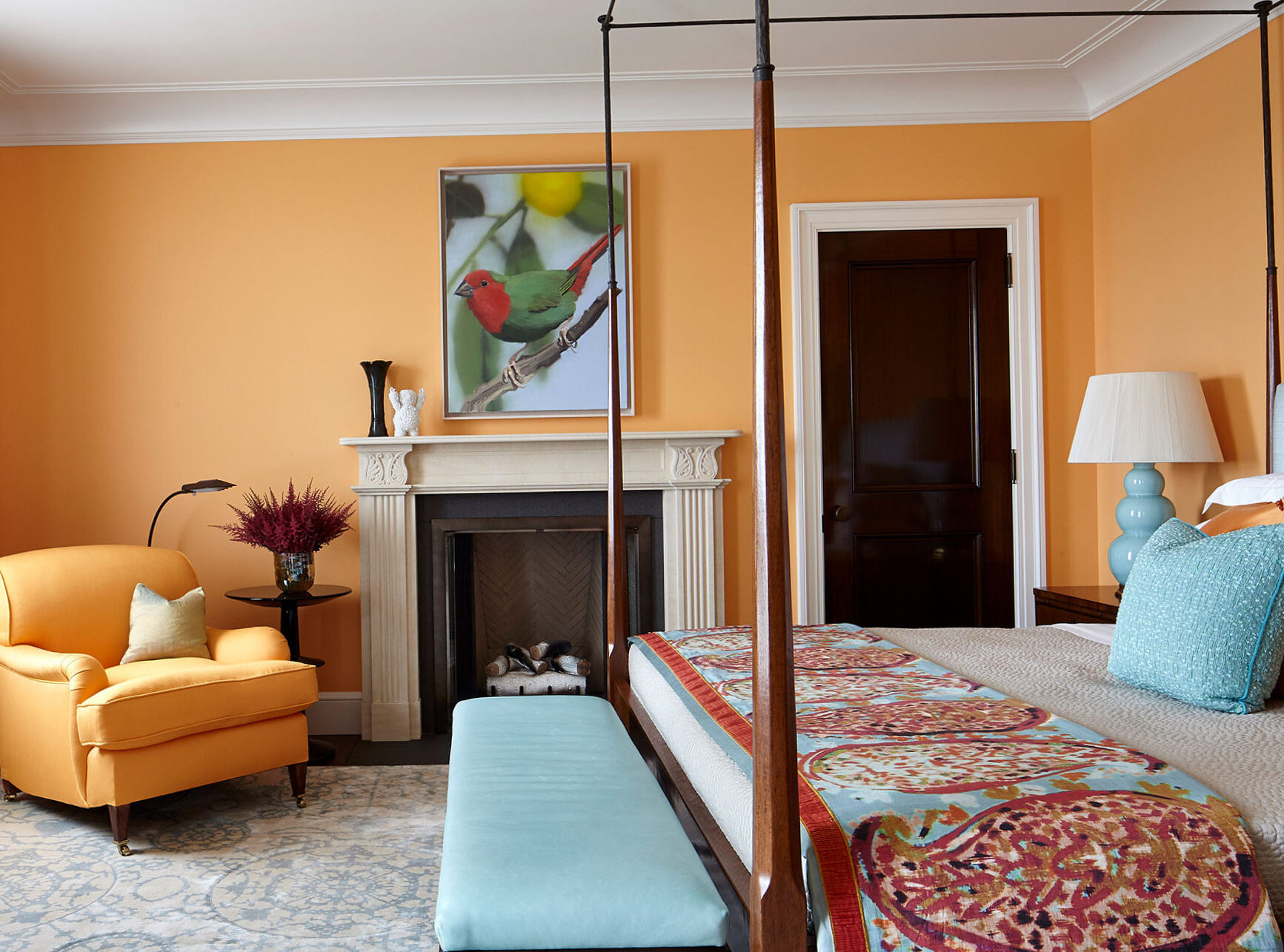
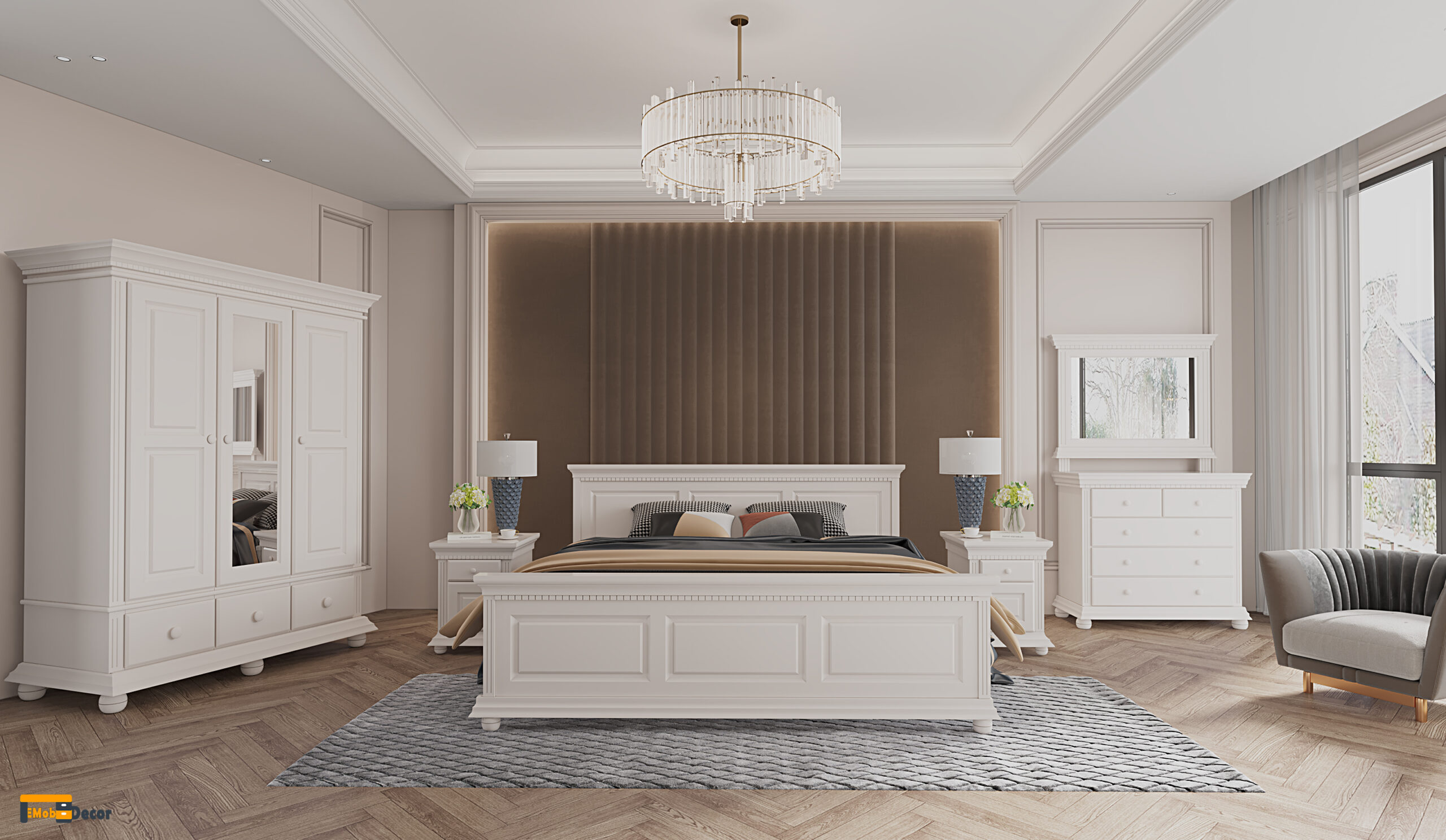
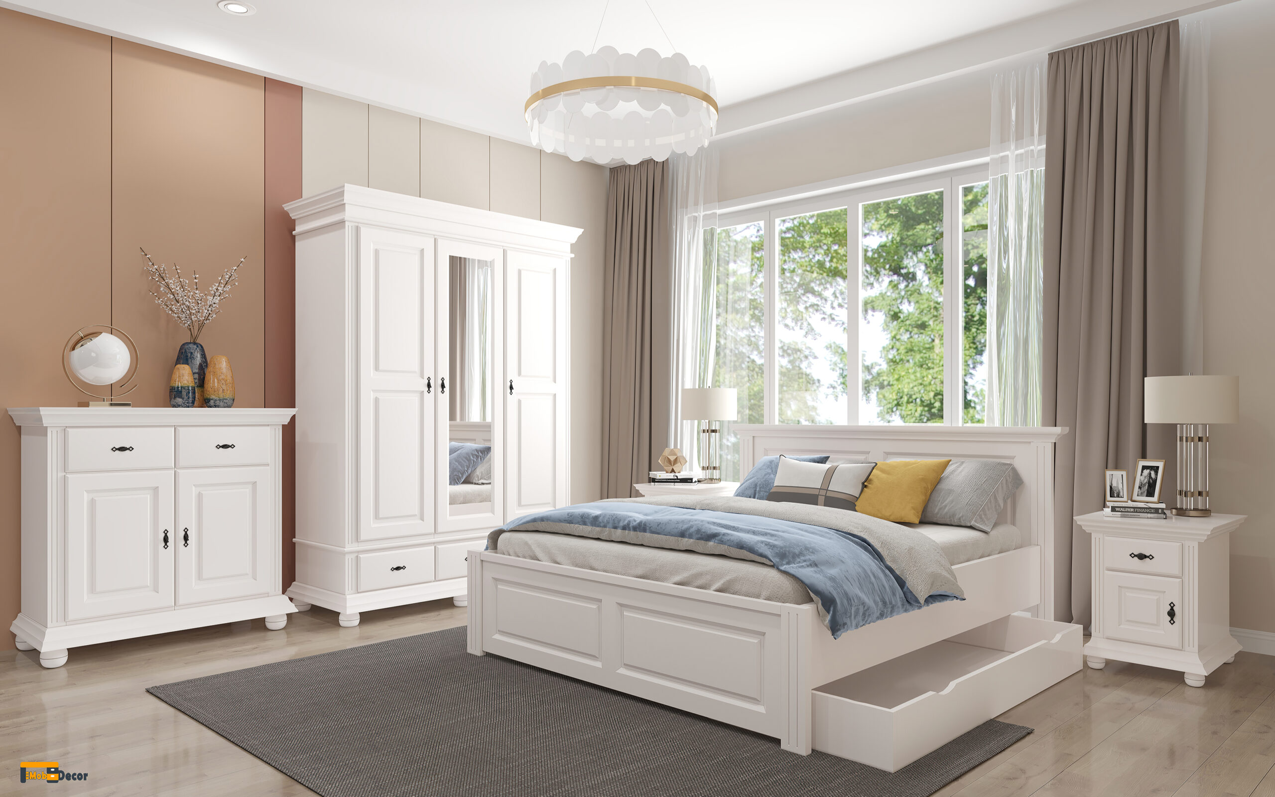
The colors evoke an emotional response. In general, cold colors (blue, green and white) are perceived as restful and soothing, while warm colors (like red, orange and yellow) create a feeling of energy. The cold colors are soothing in private rooms, like the glacier blue which covers the walls of this bathroom; Hot colors are a good way to animate social spaces.
Color psychology is a small obsession among painting professionals. Many say that you should choose a color based, at least in part, on how a part is used and on the atmosphere you want to establish.
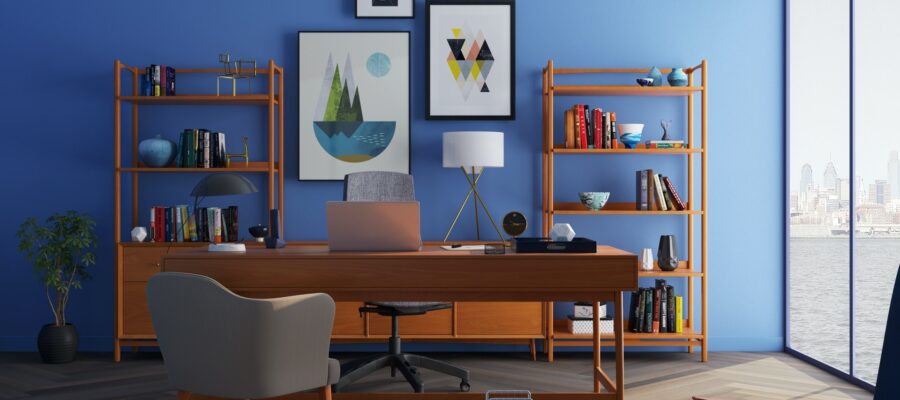
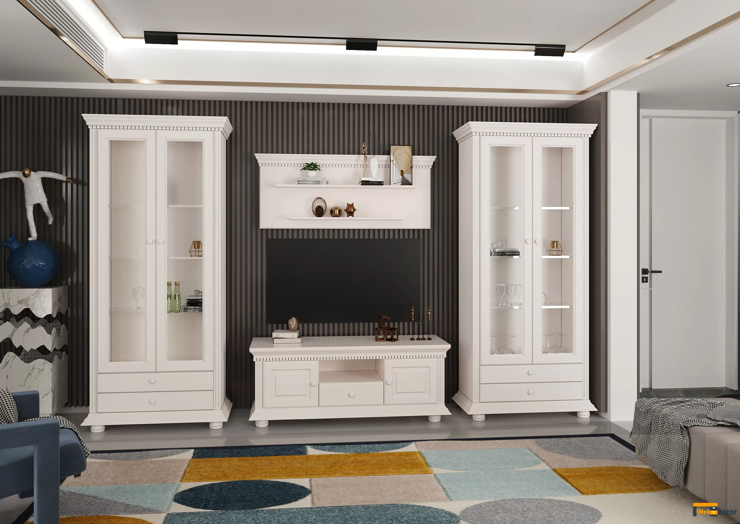
We suggest you paint living rooms (dining rooms, kitchens, family rooms and salons) in warm colors such as jonquille yellow, coral or cranberry, and give private rooms (home offices, Water, bedrooms) colder shades such as sage green, purple or sky blue.
4. Use the whites
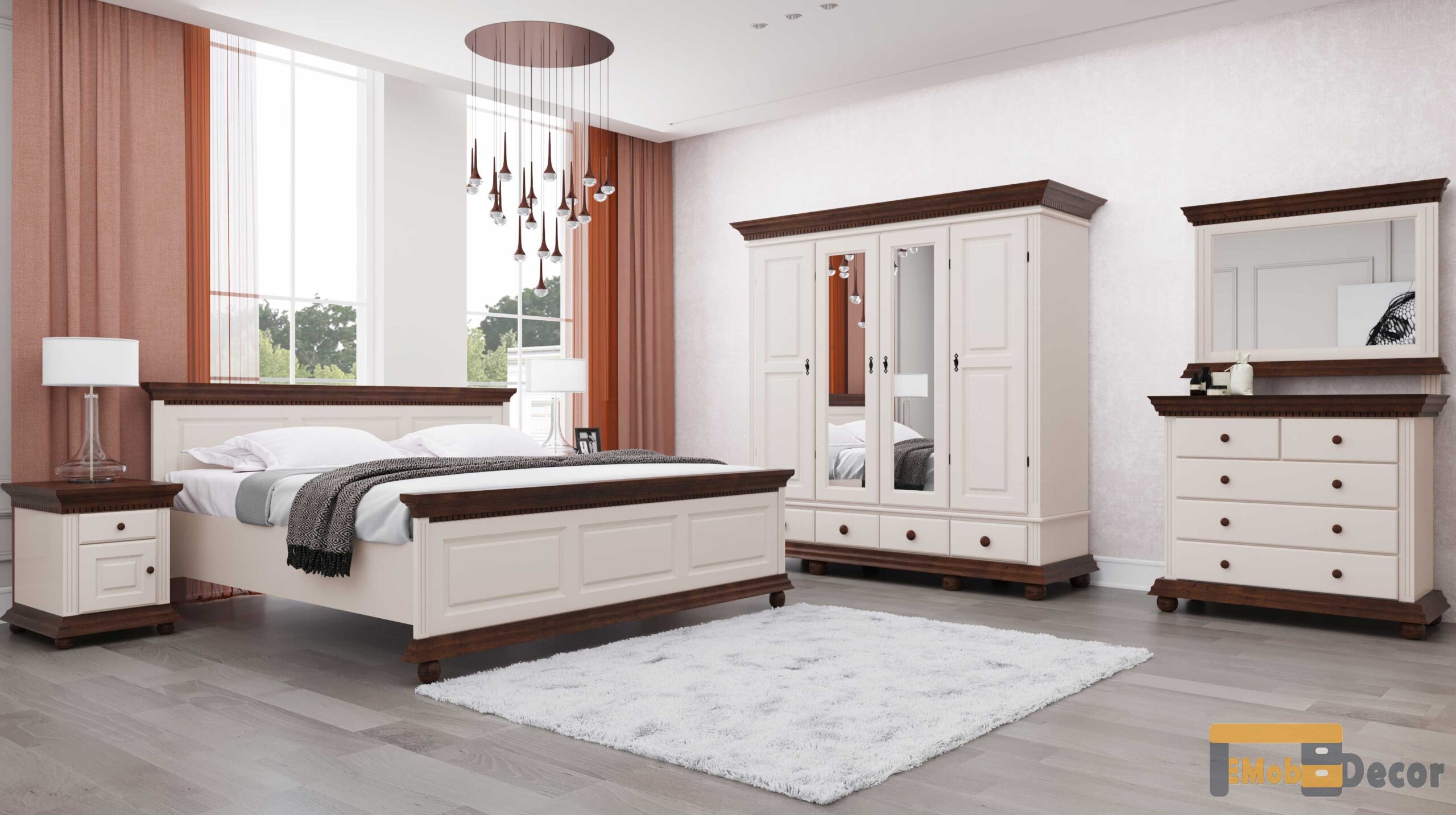
Whites exist in an astonishing variety. The pure, «clean» whites, are formulated without tinted subns. They are favored by designers who seek to highlight works of art or furniture and are often used on the ceilings to create a neutral field above the head. Most other whites are either hot, with shades of yellow, rust, pink or brown, or cold, with shades of green, blue or gray. Use warmer whites in rooms without much natural light, or to make the great outdoors.
5. Make the small or more comfortable small spaces
In general, brilliant whites can give the impression that a space is larger and more open, while warm colors create a feeling of intimacy. At the most rudimentary level, large parts can generally have more colors than small.
Of course, some small spaces do not need to be large: if you are looking to create a welcoming or comfortable atmosphere in a home, an office or a library, for example, the hunter green or the Terracota color will suit you better than pale fishing.
6. Use the color to valor the architectural characteristics of the part
One of the most effective ways to use the color to transform a part is to enhance its architectural characteristics. The moldings, the chimney coats, the built -in libraries, the fitted doors, the paneling, the windows and the doors are all opportunities to add another layer of interest to the colored walls.
To go further:
latest posts published
The natural essence for personalized bedroom
The foundation of an authentic, natural bedroom
10 bedroom arrangement ideas for a new beginning »EmobDecor
a way to express your personal style
5 tips to find the right offer
Bed upholstered with folding bed: ideal solution
Living solid wood: turn it into a natural refuge
Uses these interior design ideas house in the country
Models and modern curtains – tips and ideas »